Waukee… The Key To Good Living
 After 42 years with the same logo, the City of Waukee announced yesterday evening that they will be rolling out a new brand identity.
The previous, purple and gold key-themed logo, was first introduced in 1973 as the winning design in a City-sponsored contest. However, for this logo redesign, the City partnered with advertising agency Flynn Wright to create a new brand strategy and position.
“Extensive research showed us that Waukee was top-of-mind among metro area respondents, and that people viewed it as a thriving, clean, family-friendly community with great schools and amenities,” said Waukee Mayor Bill Peard. “Based on that research and stakeholder feedback, we set out to update our brand to reflect Waukee’s many assets and to position it uniquely in the marketplace.”
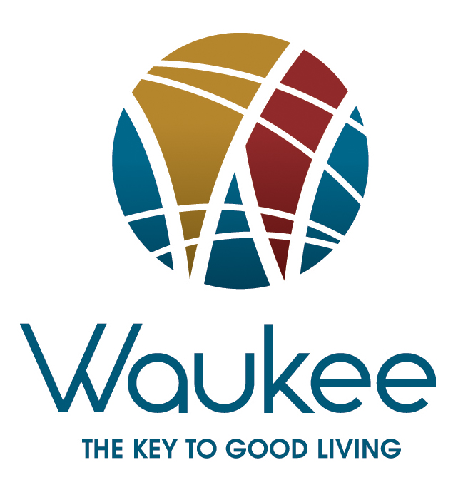
The City of Waukee has selected an abstract composition in a rich color palette that features a “W” amongst intersecting lines to illustrate the various life paths you can enjoy in the community. The motto, “The Key To Good Living” remains as research indicated it truly encompasses the excellent quality of life in Waukee.
The new logo will be implemented on Waukee-branded signs, vehicles, apparel and other materials this month. Read the full press release for further details on the selection process.
